This is my overall CD cover design broken up into each section:
Head front:
For the Front of my CD Cover i decided that this should promote not only the artist but also the 'Indie Pop' genre. I chose to have some aspect of 'Indie' by having the landscape background typical of this genre to have more 'thoughtful' images but i also used the typical Mainstream 'Pop' aspect of having the artist present, although hidden by the rabbit animal mask.
For the Front of my CD Cover i decided that this should promote not only the artist but also the 'Indie Pop' genre. I chose to have some aspect of 'Indie' by having the landscape background typical of this genre to have more 'thoughtful' images but i also used the typical Mainstream 'Pop' aspect of having the artist present, although hidden by the rabbit animal mask.

Head inside left:
This idea was inspired by a Kings Of Leon album, by which the main artist was separated into sections. I decided to have all the images on my Digipak related and this part of the Digipak will include a close-up of the artist which is typically found within the 'Pop' genre but having a rabbit face layered on top subtly but still quite vivid. The animal mask, was something the artist wore in our music video and i've included it in my Digipak as an almost signature of the artist and that particular song.
 |
| King Of Leon album cover - Influence for my design |

Head inside centre:
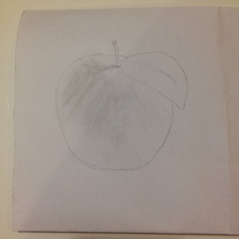
The left inside centre of the Digipak which will be where the CD is placed, is a slightly more disjunctive aspect to the Digipak of which i included due to this 'Indie' style but however, still relevant with the rest of the images on the CD. I chose to have an apple sliced in half on the CD itself rather than the background where it will be covered. But the simplicity of having just an apple photographed on a white background i think will work really well. On the head back left of the album which will fold over this image will be a photograph of a full apple, so when you open the fold, you go from a full apple to the sliced apple. This is shown at the bottom of this page.

Head inside right:
On the head inside right of the Digipak i wanted to have something relevant to the rest of my images but also by keeping to the 'Indie Pop' genre so it is suitable for my target audience. I decided to keep with the landscape photography which is typical of the Indie genre but i decided to include all the props used in the rest of the images and placed them altogether, which almost brings the album together, making them all relevant. This idea of surrealism also plays a big part in this particular photo by having props and items in places they're not normally found, this of which i feel will work very well on an album cover.

Head back left:
This image which i spoke about briefly above is the full apple which when folded over will reveal the sliced apple on the head inside centre. Although very simple, i think this works really well, especially keeping some aspects of the 'Indie' genre by having very simple designs but having 'Pop' aspects throughout the Digipak, particularly the close-ups of the artist.

The head back of the Digipak which is not photograph is going to be a very simple black design on a creamy white background. This will be placed at the top, leaving space at the bottom for the song list.
No comments:
Post a Comment